Streamlining wedding florist inquiry process to enhance the user experience and increase conversion
ROLES
UX Researcher
UX/UI Designer
TIMEFRAME
80 hours
TOOLS USED
Figma
Adobe Illustrator
PROJECT TYPE
Client Project
Responsive Web
BACKGROUND:
Who are The Flower Girls?
The Flower Girls is a local floral and wedding coordination business based that manages inquiries through Instagram, lacking a fully-responsive website.
The Flower Girls is run by Michelle D., a skilled florist and wedding coordinator with over ten years of experience. Michelle and her team have a dated website linked to the business’s Yelp page, but it lacks high website traffic and conversions. Michelle is looking to expand the business’s online presence with an updated inquiry process.
“Our website is outdated - there is only so much information that we can convey on the Instagram page. We need an improved web experience and a brand refresh in order to properly convey our inquiry process”
-- Michelle D., Business Owner
THE PROBLEM:
The Flower Girls' outdated website results in a discrepancy between client expectations and the actual quality of service.
The lack of an efficient and streamlined inquiry process puts a burden on the team, leading to additional workload and inefficiencies.
While Michelle and The Flower Girls have stellar reviews on Yelp (5-star rating), their dated website does not accurately reflect the quality and creativity that they are known for.
Furthermore, operating from their Instagram page limits the small business’s potential to expand its client base. Messaging Michelle through Instagram increases the “back and forth” between Michelle and the client. This could deter potential clients while waiting for a response.
The task at hand:
Redesign a responsive website and refresh the brand identity for The Flower Girls, focusing on an application/inquiry flow to best accommodate both business and user goals
Poor Accessibility
Outdated branding
Lack of streamlined inquiry process
Unresponsive on mobile
Redesign with accessibility in mind
Update brand image
Improve current inquiry process
Design a responsive site
Business Goals
Before starting other research, I interviewed the client to understand how she defines success.
Improve user trust/confidence to work directly with The Flower Girls
Increase their website traffic, increase the number of people who inquire directly on website
Increase # of bookings outside of wedding season months
Maintain a high customer satisfaction rate
HEURISTIC EVALUATION:
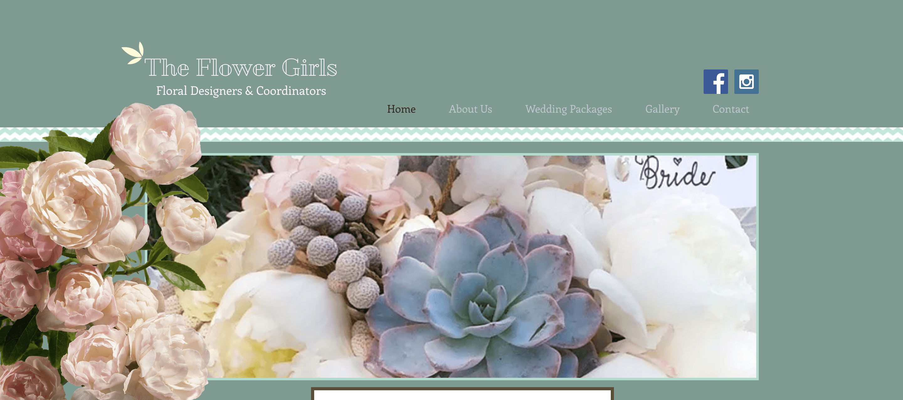
Auditing the Existing Design
I carried out a thorough audit of the existing website, assessing the current shortcomings based on accessibility and usability principles. This audit also helped convey the site’s core accessibility issues to non-designers.
ISSUE #1:
Poor accessibility coupled with low image quality
The landing page currently has no content other than a dated hero image and a navigation bar, making it difficult for first-time users to understand who The Flower Girls are and what they do.
Brand identity can be improved
The current logo is inconsistent with a logo the business owner uses on her social media pages. Since her social media pages currently get more traction, this logo appears inconsistent with her brand identity. The client has asked for a brand refresh, so I would consider a more distinguishable brand logo that aligns with her brand values.
The text vs. background contrast is low
The black text for selected items on the navigation does not meet WCAG guidelines. The color of the unselected menu items appears to be low contrast as well.
Hero image quality
This hero image awkwardly spans 3/4 of the screen. The hero image quality itself is a bit blurry and low quality, which decreases user trust. Additionally, the client does not use peonies very often, but the peony imagery is prominent on at least two main screens. This is not very representative of her current floral designs.
ISSUE #2:
Challenges with Visibility of System Status in the Contact Form
Currently, the simple contact form requires a subject and message before the user hits the “Send” CTA. The “Send” CTA does not have a hover or focused state, and this lack of affordance and visual clarity could cause user confusion or bounce rates.
Furthermore, the client requires other information, such as the wedding date, in order for a formal consultation. Therefore, form fields should be changed to reflect the necessary information required from the user.
Form Field Labels
The client requires other information, such as wedding date, in order for a formal consultation. Therefore, a “subject” probably is not necessary and should be changed to reflect necessary information required from the user.
Button states
The “Send” CTA does not have a hover or selected state.

ISSUE #3:
The font choice and absence of a clear visual hierarchy hindered efficient page-scanning.
The website suffers from a strong imbalance of content distribution - there’s either no copy (providing no context to their floral services and background) or too much text (as in the case of their About section), making it difficult to read and comprehend.

Inconsistent Titles
Every page has a title, but the “about” section does not. This H1 text is also difficult to read. It’s a good idea to consider changing her H1 text to a serif to improve readability.
Inaccessible typography
The typeface for body text has poor readability, which makes it hard for the “About” section to legitimize her work and credibility.
RESEARCH
USER SURVEY
Users prefer inquiring directly online instead of by phone
In order to better understand user expectations when visiting a florist’s website, I conducted a user survey with 18 participants that had experience working with a wedding florist, or were interested in booking a florist for an upcoming wedding/event.
66.7%
of participants stated that the website design and overall aesthetics contribute greatly to their decision of choosing a floral designer.
55.6%
of participants prefer to book an intake call or consultation through the florist’s website.
44.4%
of participants believe that understanding the florist’s booking process is somewhat important in order to feel more comfortable knowing what to expect.
USER INTERVIEWS:
The user interviews were very insightful, particularly in terms of the subjects’ thoughts and feelings towards making an inquiry.
I spoke to 5 users interested in booking a florist for their upcoming wedding or event. I aimed to understand what motivates users to inquire for estimates, uncover potential pain points, and learn more about what users expect to see on a florist website.
Participants
5
Age
26-42
Type
Remote, Zoom
Here are the key themes, derived from affinity mapping.
THEME #1:
Social anxiety is a barrier to inquiry - rejecting a wedding vendor after receiving an estimate is uncomfortable.
A common barrier for potential clients is social anxiety, with 4 out of 5 users expressing concern about initiating a consultation due to fear of receiving an unaffordable price estimate.
“When you have to initiate, it's a hard thing to go through and talk to a stranger and then tell them no thanks. If I knew what your costs were upfront, then I could pinpoint if I should reach out or not.”
THEME #2:
Fear of articulating their floral vision inaccurately
There is a common fear among users that their florist may misunderstand their vision, resulting in inaccurate execution on the biggest day of their lives.
“I find it difficult to accurately communicate the kind of flowers I wanted.”
THEME #3:
Lack of knowledge of flower seasonality and substitutions
All five interviewees demonstrated a limited understanding of floral design and associated costs, resulting in potential overspending. The lack of knowledge about floral design and the inquiry process is prevalent among couples who are working with a florist for the first time.
“When it’s your first time working with a wedding vendors, I feel like you never really understand what you need”
COMPETITIVE ANALYSIS
The competition lacked a way for users to check if their wedding date is available prior to inquiring for an estimate.
3/4 competitors DO NOT showcase color palette options within their gallery. This could potentially be helpful for users who lack a clear vision or are indecisive on color scheme.
3/4 competitor websites DO NOT provide expectations about the floral booking process. This gap in understanding could potentially be an opportunity for a solution.
Being able to check date availability could potentially be a solution for both the business and the user, saving time and effort.

DEFINE & IDEATE
USER PERSONA
Meet Melissa, the Perfectionist
Melissa is looking to hire a florist for her wedding. She has a strict budget without room for compromise. It is her first time working with wedding vendors and she wants to ensure that her big day matches her vision.

Melissa
The Perfectionist
Project Manager
Los Angeles, CA
Masters
FEMALE
32
LOCATION
EDUCATION
GENDER
AGE
Personality
Anxious
Perfectionist
Creative
“I want to make sure I feel seen and heard during my initial consult with my florist. The flowers have to be perfect and match my vision”
Bio
Melissa got engaged a few months ago, and is deep in the process of planning her wedding. She is looking to hire a florist and has a set budget that she doesn’t want to compromise on. It is her first time working with so many vendors, and wants to ensure that her big day is perfect.
Goals
Hiring a reliable, personable florist
Receiving personalized attention and creative ideas to fit budget constraints
Motivations
To have a personalized wedding reflecting her personality and style
Convenience: the desire to make the wedding planning process as easy and stress-free as possible
The desire to impress friends and family
Pain Points
Doesn’t like awkward conversations where she has to reject a vendor
Feeling uncertain about finding a florist who can bring their vision to life within their budget
Feeling limited by a tight budget
Lack of knowledge of seasonality and floral substitutions
Cannot find information on what to expect for a consult
Needs
Personable, transparent communication between her and the florist
A way to view the florist’s work to ensure it matches her vision
A streamlined booking process with information on what to expect for a consult
Guidance/expertise from the florist on flower seasonality, substitutions, and cost-effective design choices
Influences
Pinterest wedding boards
Influencer/celeb weddings
Blogs
Wedding portfolios
Frequently used apps
USER JOURNEY MAPPING
A more holistic view of Melissa’s experience
A “Current State” and “Future State” journey map helped the client visualize the current user journey navigating the Flower Girls website. With Melissa’s needs and pain points in mind, I created a future state map that addresses potential opportunities and outcomes for the new responsive site.


How might we help couples undergoing the wedding planning process feel confident that their florist will accurately execute their vision?
With my research synthesized, I completed two rounds of collaborative ideation sessions using timed constraints to turn research insights into solid design decisions.
BRAINSTORMING IDEAS
From Research Insights
Design Decisions
DESIGN INSIGHT #1:
Inform users of what to expect prior to making the first point of contact
To minimize uncertainty to inquire, the website could benefit from an updated content strategy that provides necessary information of ser and expectations of the booking process.
DESIGN INSIGHT #2:
Provide education and guidance on floral design elements
Providing education and guidance on floral design elements, such as seasonality and substitutions, is crucial to help couples execute their vision and stay within their budget.
DESIGN INSIGHT #3:
Incorporate visual aids like a wedding portfolio to help users share their preferences and inspirations through an online inquiry form
Emphasize the florist's commitment to understanding and executing the client's vision accurately on the website, and provide guidance on aesthetic scope and vision.
Incorporate a section in the inquiry form for users to optionally share preferences for their big day.
SITE MAP
Structuring the User Experience
The old IA had 5 main pages, including a ‘Packages’ page. This IA was consistent with other florist websites. Recent sales have indicated that wedding packages are unpopular due to a lack of customization and limited options. Therefore, the client opted for a ‘Services’ page with an updated content strategy for both Full-Service and A-La-Carte floral designs.

DESIGN
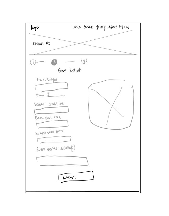
LOW-FIDELITY SKETCHES
Low-Fidelity Sketches for quick ideation of page layout
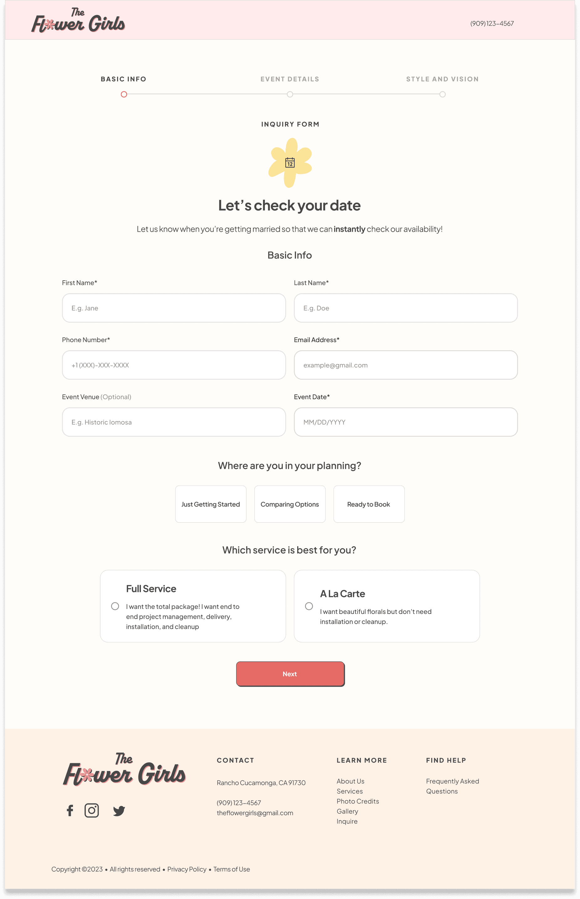
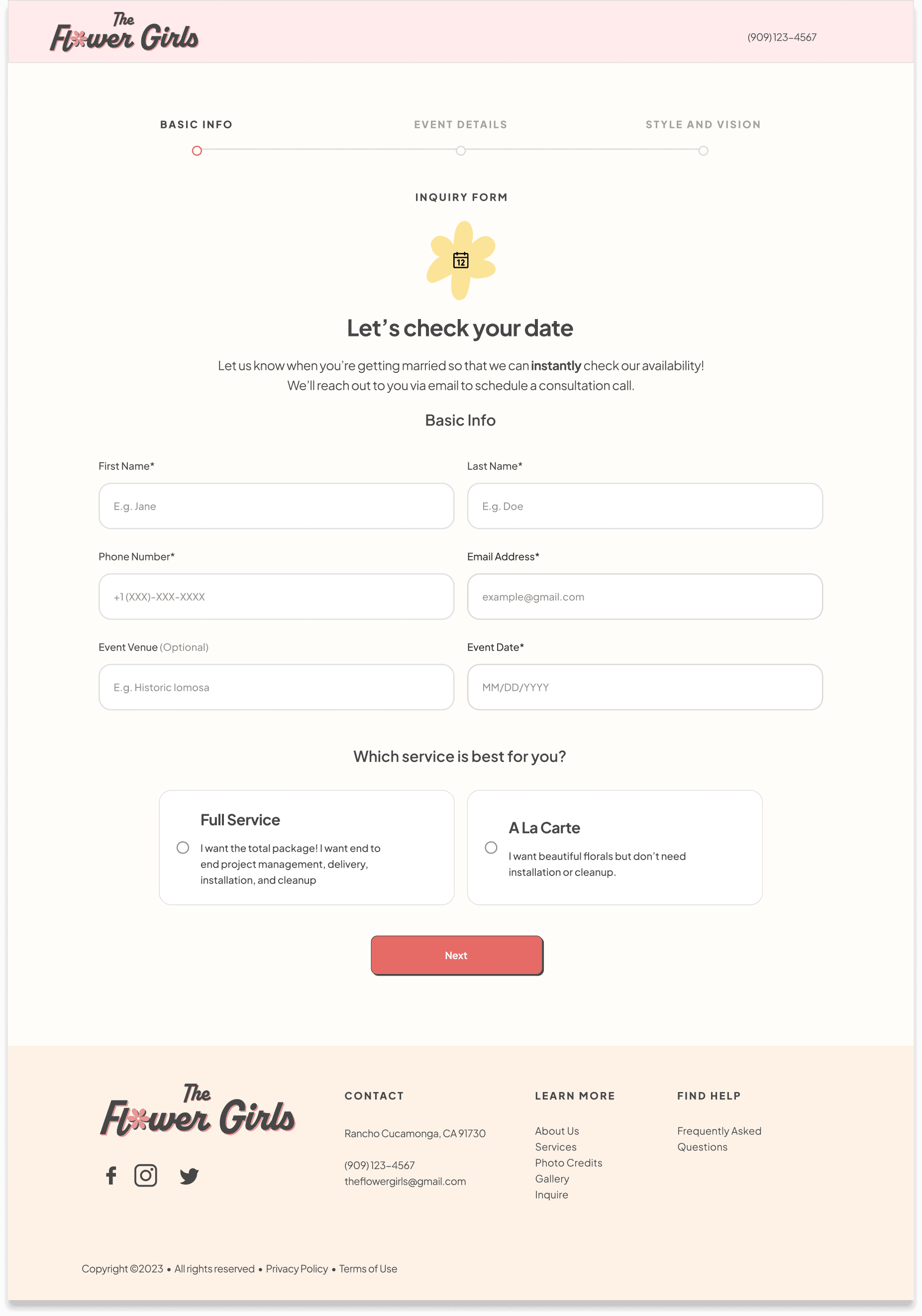
With the user and task flows handy, I sketched options for page layout, including a single and multi-step inquiry form process. I opted for a multistep form to make the amount of information requires appear more organized and less overwhelming.

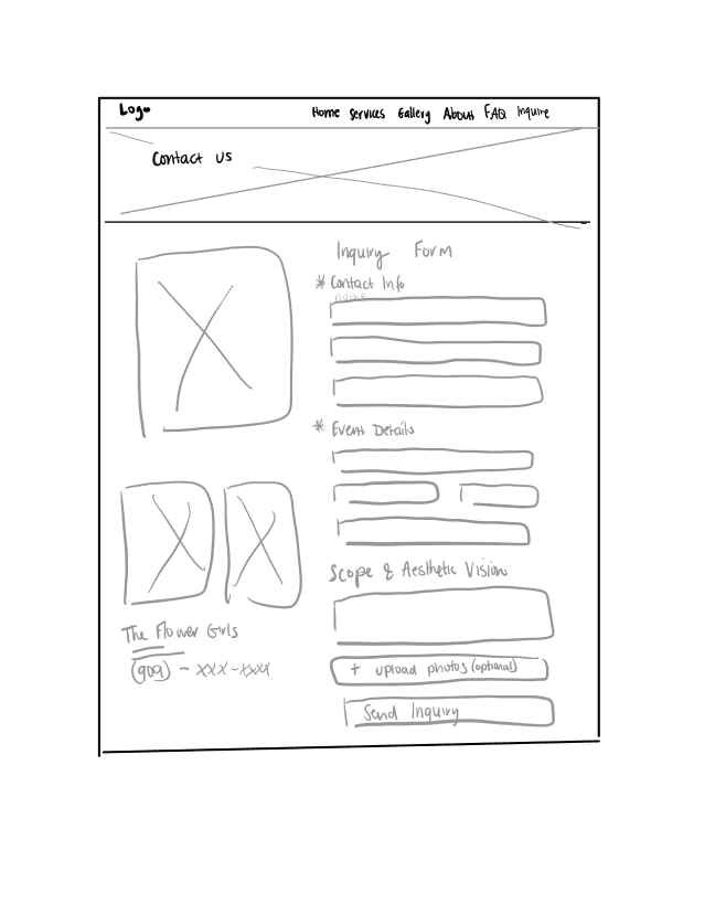

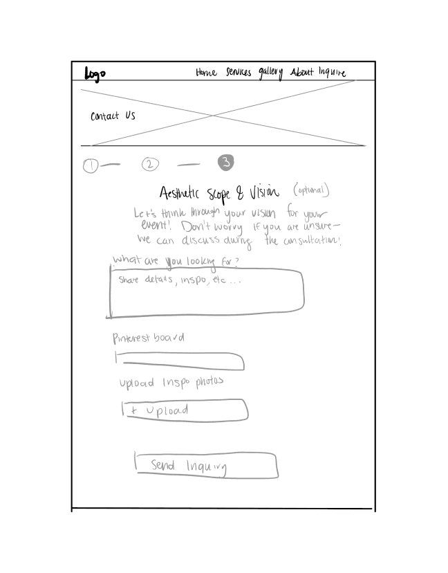


Inquiry Form V1
Inquiry Form V2 (3 pages)
V1: One page form
Contact Info
Event Details
Scope and Vision (Optional)
Con: might be overwhelming to user if they see so many form fields?
User fills out basic info,
checks wedding date availability
Why? Bc users want to save time with inquiries and don’t want to fill out an inquiry form if the wedding date is unavailable.
If date is available, user fills out other event details, clicks “Next”
User fills out their initial vision and can upload inspiration photo/link to Pinterest boards. After “Send Inquiry”, a confirmation page will appear with next steps.
Progress stepper
Why multistep?: makes the large amount of information required to complete a long form appear more organized and less overwhelming.
Mid-Fidelity Wireframes
Fine-tuning the layout and interaction design
Translating the sketches into mid-fidelity frames helped test the content design and interaction design and gain feedback from the client and other designers early before moving into high-fidelity.

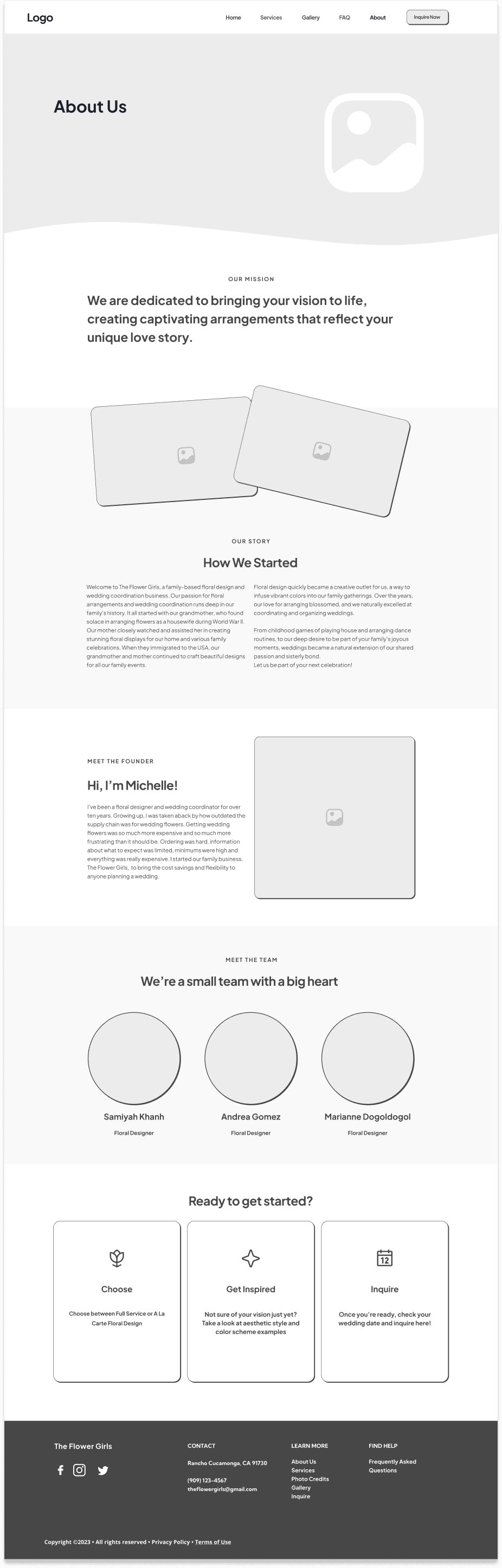
Mid-fidelity desktop “Home” screen (left) and desktop “About” screen (right)
BRANDING
Expressing a friendly and inviting visual identity
I collaborated with the client to discuss a new branding direction. She wanted a complete brand refresh, noting that the previous sage brand color felt “cold” and “uninviting.” With brand values in mind, I updated the logo for a more refreshed, modern look.
The Flower Girls’ brand values: Friendly, Inviting, Transparent, Delightful, Creative
TYPEFACE sELECTION
Wordmark
Colors
ICON SET
Plus Jakarta Sans
Primary (30%)
FEF2E6
Primary 1
2D3648
Primary 2
Brand
E66B66
Secondary 1
F09491
Secondary 2
FFEAEC
Secondary 3
Accent
DDD2E0
Accent 1
E1EBF5
Accent 2
EBD2D5
Accent 3
Neutrals (60%)
474747
Text Color
DDE0E4
Line
F8F9FC
Base Background
FFFFFF
White Text
Desktop
H1 - Plus Jakarta Sans, 48 px
H2 - Plus Jakarta Sans, Bold, 36 px
H3 - Plus Jakarta Sans, SemiBold, 32 px
H4 - Plus Jakarta Sans, SemiBold, 24 px
H5 - PLUS JAKARTA SANS, EXTRABOLD, 16 PX
Body - Plus Jakarta Sans, Regular, 16 px
Mobile
H1 - Plus Jakarta Sans, Bold, 36 px
H2 - Plus Jakarta Sans, Bold, 32 px
H3 - Plus Jakarta Sans, Bold, 24 px
H4 - Plus Jakarta Sans, SemiBold, 20 px
H5 - PLUS JAKARTA SANS, EXTRABOLD, 16 PX
Body - Plus Jakarta Sans, Regular, 16 px
TESTING AND ITERATIONS
Assessing confidence and comfort level with the new inquiry process
I conducted moderated usability testing via Zoom with five users in the target user base. I focused mainly on quantitative data using a Likert scale (1 - 5) to assess confidence levels, comfort levels, and ease of use.
SUCCESS METRICS:
The design will be successful if...
It quickly and clearly conveys information about who the Flower Girls are, and what they offer.
Clarity of copy and information: 4.6
It evokes trust and confidence in the business and its services.
Comfort level with inquiry form: 4.6
It is simple to navigate, evoking user comfort in making the first point of contact.
Ease of navigation: 5.0
Here are some key findings after organizing verbatim quotes, first impressions, and nonverbal observations within an affinity map:
The redesign felt more professional and inviting, inspiring confidence to work with The Flower Girls.
“The overall experience was really good! I feel like this is kind of the optimal florist website because it clearly lays out services, expectations, and a timeline. It makes inquiring less anxiety-inducing because it gives a starting point to talk about over the phone”
Overall, the new inquiry form’s questions evoked comfort and enhanced willingness to inquire with an average comfort level rating of 4.6.
5/5 users stated that they were pleasantly surprised with the vision preferences on the inquiry form, and expressed greater confidence in inquiring.
“If you didn’t have that [vision preferences] on the inquiry form, I think I'm kind of left wondering… as a creative does this person not want my input? I think that's why it does feel more inviting.”
“There was no point that I felt like there were too many questions or that the questions were invasive”
The clarity of content scored an average rating of 4.6 - users were able to articulate the differences between the types or services offered.
“I appreciate the clear breakdown of services - it takes the guesswork out of what to talk about in the consultation call”
Prioritizing Iterations
After discovering common themes, I placed them into a prioritization matrix to prioritize the changes. The high-impact, low-effort findings are therefore the most “severe.”
High Impact
High Effort
Low Impact
Low Effort
Removing planning question
Changing budget field to a dropdown
Iterate copy on service cards
Iterate copy for consultation call expectations
Include recent 2023 trend report
Represent color palette visually in dropdown
Remove hero section visuals that overlap hero image
Filter gallery by bouquet style and color palette
Here are the high priority key findings and the iterations they inspired:
FINDING #1:
Users felt slight hesitation towards inputting an exact budget within the inquiry form.
To minimize hesitation, I changed the form field into a dropdown where users can select a budget within the user's desired range. This helps avoid potential hesitations in completing this form.
1
Before

After

Dropdown for budget range
I added a dropdown for the user to select a range to mitigate hesitations and increase user comfort.
Budget Question
Budget question felt necessary but users would have liked to select a dropdown menu for a budget range instead of entering an exact budget.
FINDING #2:
The copy within the service cards was not presented in a digestible format.
I enhanced the clarity of service cards to clearly articulate the unique benefits of each service.
Before

After
OVERVIEW
Choose between Full Service and A La Carte
We know that planning your special event can feel overwhelming with what seems like a million micro-decisions! The Flower Girls are here to walk you through a streamlined planning process to realize your floral vision and free up your headspace as you look forward to your special day.
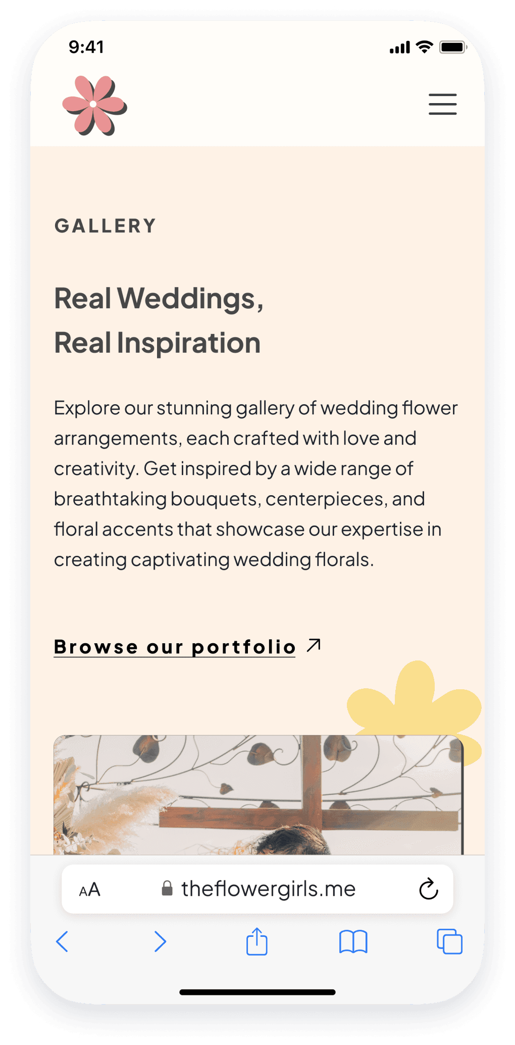
See Our Past Events
We feature examples of our past events here so you can get inspired
View Our Gallery
Copyright ©2023 • All rights reserved • Privacy Policy • Terms of Use
CONTACT
Rancho Cucamonga, CA 91730
(909) 123-4567
theflowergirls@gmail.com
LEARN MORE
About Us
Services
Photo Credits
Gallery
Inquire
FIND HELP
Frequently Asked Questions
Services
Full Service
Minimum: $2000
What’s Included:
Flower delivery at multiple locations
Rentals from our inventory
Delivery and set-up of ceremony and reception flowers
Transfers of arrangements from ceremony to reception
Breakdown and clean up of florals at the end of event
Check Availability
A La Carte
No Minimum
What’s Included:
Flower delivery at one location
Wedding party flowers
A limited number of centerpieces
Check Availability
Full Service
Our floral experts will help you plan every detail for your perfect day. From moodboards and crafting your custom quote, to sourcing rare blooms for your one-of-a-kind installation — we’ll custom tailor every petal to bring your dream wedding to life.
You’re a good fit for Full Service if...
You need to rent an arch for your ceremony.
Your vision includes lots of pillar candles, lanterns, or candles
You want items such as foliage table runners.
You’ve dreamt of having ranunculus, poppies, garden roses, or other very specific floral varieties present.
The game plan for the wedding day is going to be involved: multiple drop off and set up sites, lots of moving parts throughout the entire day.
What To Expect
Next 2 weeks
Let’s chat! We’ll figure out your custom quote, mood boards, itemized proposal, and contract.
Week Of
The flowers are here! We’ll treat them with care, making sure they’re perfect for the big day.
Your Big Day
The Flower Girls Team arrives! We’re here to make sure every detail is considered.
After Ceremony
We’ll clean up so you don’t have to worry about anything.
2-3 Months Before
Let’s meet in person! Design meetings, site walk-through, and floral mockups
1 Month Before
Details are finalized! We’ll put the finishing touches on your design concepts, we’re ready to go.
A La Carte
The À La Carte pathway is perfect for clients looking to feature beautiful florals at their special event, but who don’t need all of the services included in the Full Service option. It is a great fit for those looking for a streamlined planning process at an accessible price point.
You’re a good fit for A La Carte if...
You just need personal flowers and table centerpieces, and maybe a few other arrangements to have here and there.
Clear glass vases are just fine – let the flowers shine.
Flower varieties are not of importance to you, but you know you really like a specific color palette.
You don’t need an arch installation for your ceremony.
Our team can drop off all of your flowers at one location, and a friend of yours will place them on the tables.
Home
Services
Gallery
FAQ
About
Inquire Now
Unclear copy within cards
One user had difficulty explaining the differences between the two services, making it difficult to select the service they would want.
Enhanced clarity
I updated the services to include a list of unique offerings in a more digestible format.
FINDING #3:
Users expressed confusion on the necessity of the “Where are you in your planning?” question.
Users felt that the question wasn’t necessary, and one user expressed hesitation in answering due to fears that the business might treat her differently if she picked “just getting started” vs. “ready to book.”
To align with the business goals of maximizing inquiries, I opted to remove this question from the form as it currently served as a potential barrier to inquiry.
Before
After
Removed Question
After clarifying with the client, this question could be removed and addressed in the initial call.
Planning question
One user pointed out that she felt hesitant answering this question because she was anxious that the business would treat her differently depending on the option chosen.
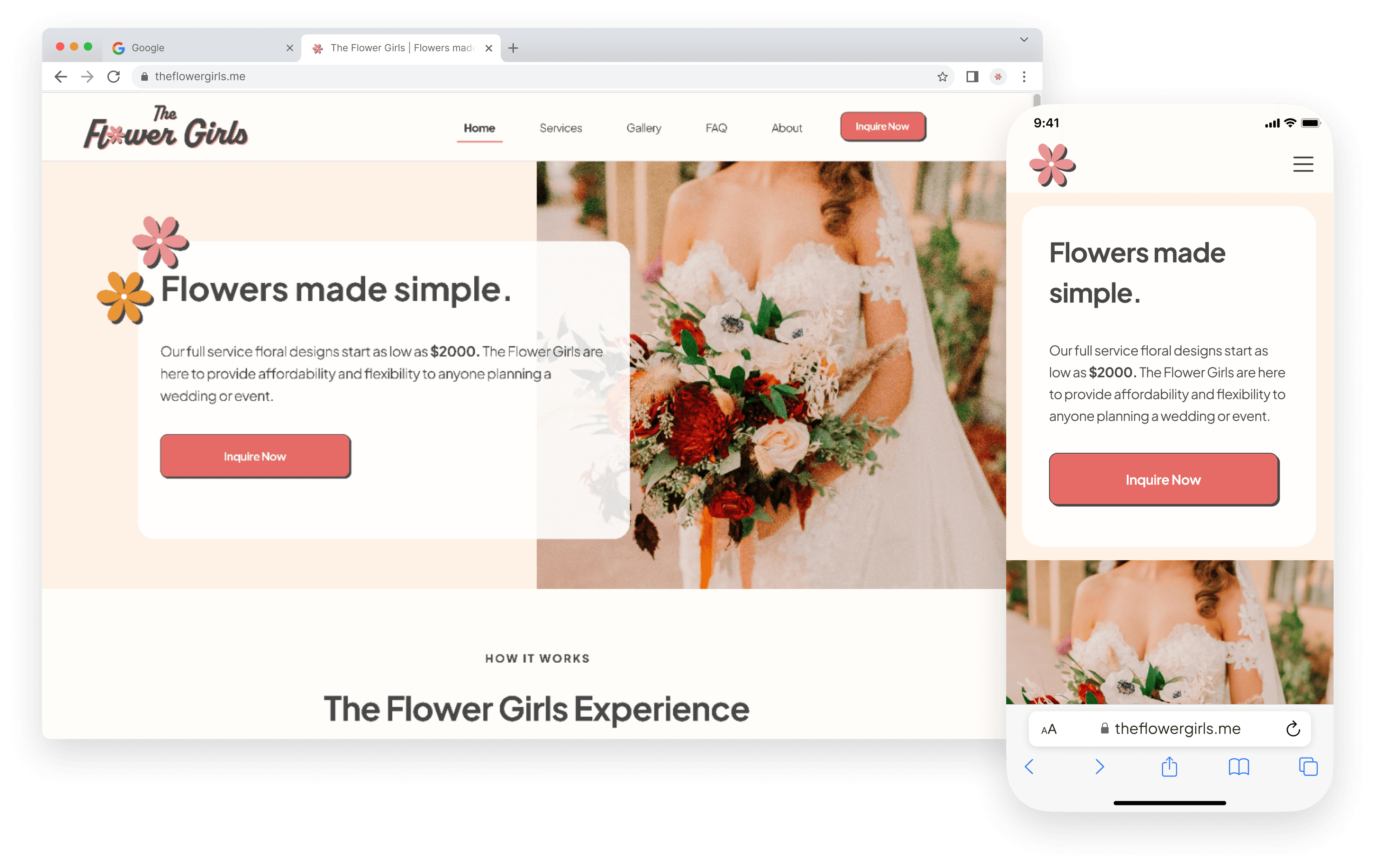
THE SOLUTION:
The Final Desktop Screens

A transparent, inviting homepage
The new hero image and headline give the user a reason to scroll, advertising a transparent Full Service minimum of $2000 (and deposit price) from the get-go.
An explanation of their booking process is clearly outlined
A clear comparison of the differences between The Flower Girls and a traditional florist are highlighted, clearly outlining the unique selling point of the business.
Wedding date availability checker that streamlines inquiries, saving the user time and effort
Users can check the availability of their wedding date prior to completing the multistep inquiry form
This streamlines the business’s inquiry process and minimizes double bookings or phone calls.
An online inquiry form with the option to input vision and color preferences provides a more delightful user experience and enhances confidence to inquire.
A source of visual inspiration to enhance user confidence
Users now have a more visual context of the color palettes and bouquet shapes designed in previous weddings
The beginning of the gallery features wedding portfolios that showcase previous design work

MOBILE SCREENS:
Screens optimized for mobile


REFLECTIONS
KEY TAKEAWAYS
The success of the website lies in finding the sweet spot where user goals are met, ensuring a delightful user experience, while simultaneously achieving the desired business outcomes.
This project was my first with a real client and actual users. The challenges of having to design a real-world project helped push me to determine what was necessary to deliver the MVP and stay focused on designing with real users in mind. I gained valuable experience in working with a client and balancing user and business needs.
Perform round 2 of usability testing on the high-fidelity prototype
Complete the design handoff to the client
Finalize the design and continue to design screens for each wedding portfolio
Next steps:

